


Briefing
When we started talking about the idea of the company, and what its name would be, we had some options, but as a joke we chose the name MilHaus, alluding to the Simpsons character. This name in German (millhaus) means “House of the Mill” or “Windmill”, which has a lot to do with our profile. Our history as professionals has always involved understanding the client, proposing the best solution and serving them in the best way possible, that is, receiving the gross demand and returning the “ready” solution.
Our service is to develop customizations and integrations between contact center solutions, propose improvements and solutions to problems based on our vast experience in this market.
We are a technology company focused on Software development (Contact Center, CX, Omnichannel).
We currently have a product in our portfolio for bulk audio extraction, indexing and conversion. Through this platform, our customers can concentrate all their recordings in a single Database / Storage, regardless of the recording system. Furthermore, through a single portal, it is possible to create queries, extraction schedules, or even more complex rules for selecting recordings by agent or operation.
Colors
We chose modern colors that conveyed the idea of technological, geek, fun and young. Colors that convey a lot the idea of start up too. We worked on the contrasts between them to make the conceptual pieces more readable and interesting.
Concept definition attributes
Modern, happy, Would be, Technological, fun, nerd e Exclusive/VIP
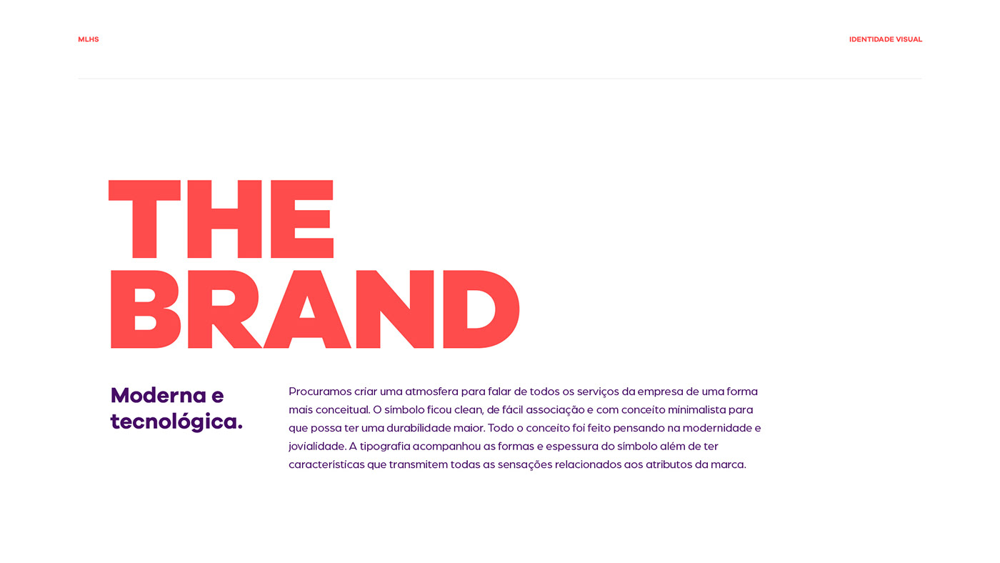
The Brand
We try to create an atmosphere to talk about all the company's services in a more conceptual way. The symbol was clean, easy to associate and with a minimalist concept so that it can have greater durability. The entire concept was made with modernity and youth in mind. The typography followed the shapes and thickness of the symbol, in addition to having characteristics that convey all the sensations related to the brand's attributes.
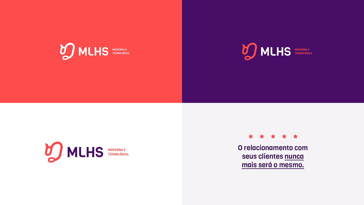
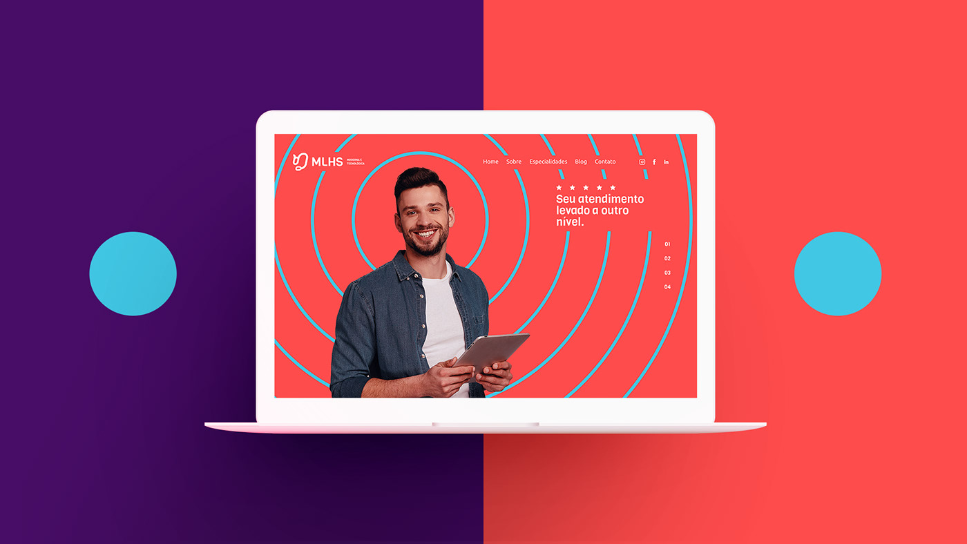
Idea for symbol and supporting elements
For the symbol we use something related to call center and customer service. For the supporting elements of the project, we used some ideas from the services provided by the company. Recording circle, stars to convey the idea of quality, ellipsis points for messages and voice sound waves to complete the entire conceptual part.


Equipe criativa do projeto
Criação do símbolo: Rômulo Bertoni
Mockups, elementos gráficos e desdobramentos: Dinamite Criativa
_______
Project creative team
Creation of the symbol: Rômulo Bertoni
Mockups, graphic elements and unfolding: Dinamite Criativa
Creation of the symbol: Rômulo Bertoni
Mockups, graphic elements and unfolding: Dinamite Criativa
_______
Follow us on instagram :)


